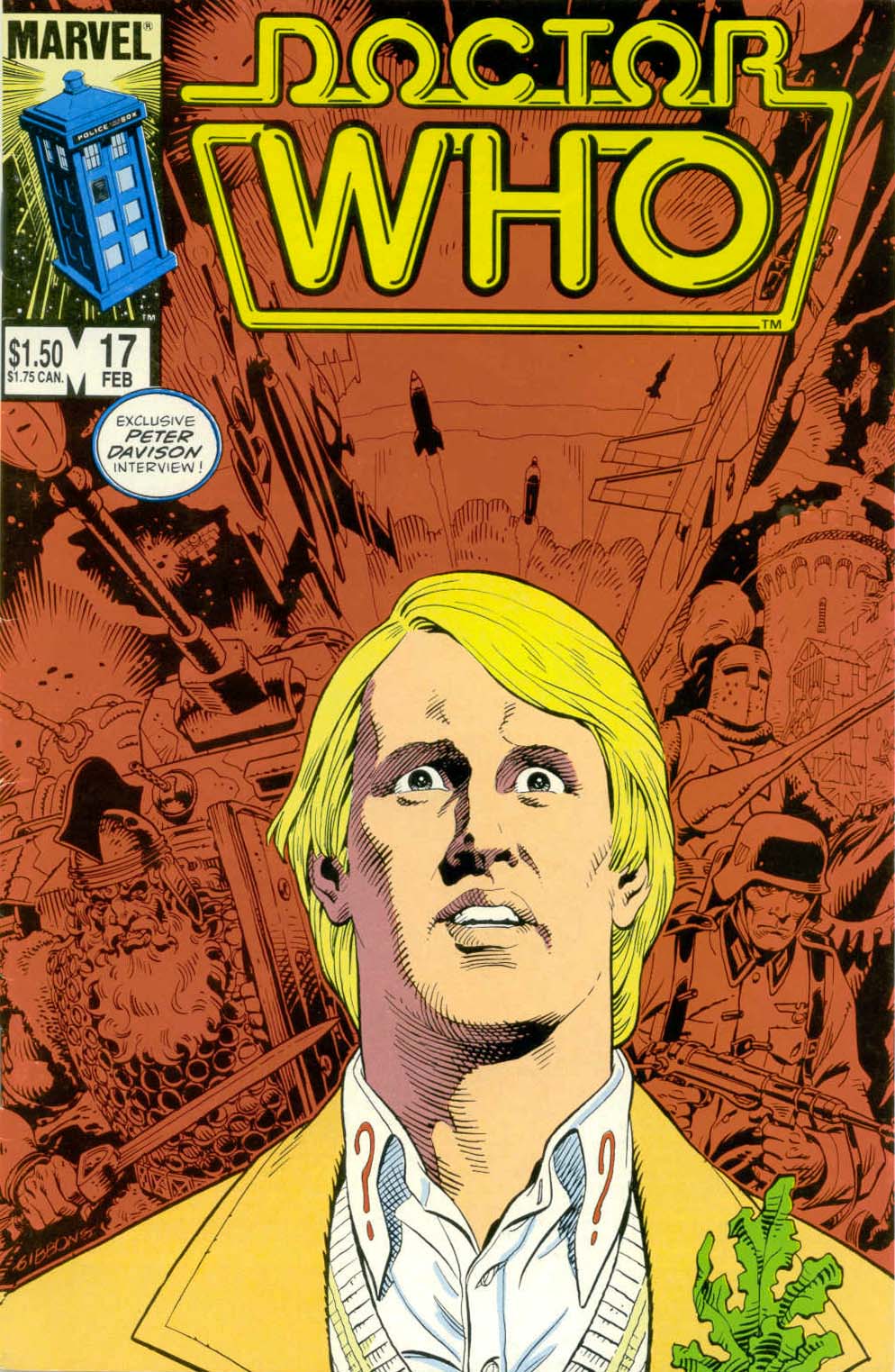
Issue 17 (February 1986)
The Front Cover
“Exclusive Peter Davison interview!” Yes, yes, we get it already. This month’s cover is actually one of our least favourites, because it features a rather unsuccessful portrait of the Fifth Doctor staring blankly ahead in – shock? Horror? Bad digestion? against a red-and-black tableau of images from the comic story. This sort of idea was done far better for issue #15’s cover.
The Strips
“The Tides of Time” Parts Five and Six
For the first time in the comic, two instalments of the same main Doctor strip have been separated in the comic by the Davison interview and a back-up strip (“Devils of the Deep”). Gibbons’ colour double-page spread for part six has been faithfully reproduced, despite the fact Sir Justin and the Althracians’ colours are rather different.
“Devil of the Deep”
One of the later, lesser-known back-up strips, featuring a gang of pirates and a kindly Sea Devil. Hardly stellar stuff.
“Crisis on Kaldor”
More back-up fun, this time with Voc robots (“The Robots of Death”). The fourth Doctor is, again, recoloured to resemble his season eighteen visage.
The Articles
“The Peter Davison Interview” Part Two
A good portion of this second part of the interview focuses on Davison’s other well-known-in-America series, All Creatures Great and Small. A bit of word association is also done, with names thrown out including Janet Fielding, Graeme Harper, John Nathan-Turner, Anthony Ainley, and Patrick Troughton. Davison discusses his favourite stories, and how he’d like, one day, to write and direct. Just because he thinks someone actually cares, O’Neill asks him how the anti-gravity sequence in Four to Doomsday was done. And, finally, would he go back for a multi-Doctor special? (He would.) Illustrated with a black-and-white publicity photo of himself, Janet Fielding, and Sarah Sutton (all in costume, from season nineteen), and a coloured line drawing of the fifth Doctor by Jack Abel.
The Columns
All of the text features have been revamped somewhat, with new fonts and backgrounds, and a better layout. As Salicrup goes on to say, this is the work of designer Janet Jackson. In fact, Salicrup’s editorial no longer even has a title, but we’ll keep referring to it as “The Editor’s Space” for continuity’s sake.
“The Editor’s Space” (by Jim Salicrup)
First off is a pitch for the “Doctor Who 1985 Summer Special Classic”, which reprinted the Marvel Premiere versions of “The Iron Legion” and “K-9’s Finest Hour” (from Marvel Premieres #57 and #58). Salicrup also mentions Gibbons’ appearance at the Doctor Who / Creation Convention, and, of course, the new design of the columns.
“Who Knows” (by Patrick Daniel O’Neill)
Ah, dig that geometric ’80s “Who Knows” logo. Details are finally available for the Hartnell/Troughton package of stories available to PBS (basically including every ’60s story that exists complete today, excluding – naturally – Tomb of the Cybermen), which are due to be broadcast first on NJN. Also listed are details for the show’s 22nd season, offered first to stations signing up for the 60s package, with the caveat that they will be split into four- and six-episode stories. Congratulations are given to DWM‘s staff for its one-hundredth issue. The rest of the column is given over to a recap of the 23rd season/hiatus situation. Illustrated with a colorized black-and-white photo of Patrick Troughton, in costume (complete with wooly hat!), from Fury from the Deep.
“Who Cares”
Jim Douglas of Raleigh, North Carolina, loved issue #12, and gives out an address for his fan club. Robert Iro, of Boulder, Colorado, liked issue #13’s “Junk Yard Demon,” but dislikes the wasted space in the “Doctor Who Bookshelf” articles; he’d also like some bios for the show’s stars, and a review of FASA’s roleplaying game. More fan club addresses come from Clint E. Middleton of Cochran, Georgia, and Joe Mason (no address) wants to see Dicky Howett’s comic spoof of “An Unearthly Child” (which was eventually printed in issue #23). Robert Robinson of Franklin, Tennessee, writes in a bit late requesting Peter Davison adventures, while Tracy Rosenberg of Glencoe, Illinois, wants to know why the neon logo wasn’t used (right away) after its introduction on the back of issue #12. Accompanied by an art deco-style colour illustration (no doubt based on a publicity photograph) of the fifth Doctor and the TARDIS.
The Adverts
“The Doctor Who Collection” (merchandise);
“For Epic Excitement-the Epic Experience” (Epic Comics).
The Back Cover
“10 Reasons to Pick Up Marvel Age Every Month.”
Cool Colours
The Marvel TARDIS this month is all blue, all the time, but the windows and door panels are a lighter blue than the rest. Somehow, though, it still gives off cream/yellow light. The new “Editor’s Space” background (with little WHOs and TARDISes) is purple. On the cover, the Doctor’s sweater stripe is again yellow. The Althracians are also yellow, with red eyes, and blue robes with red-and-white trim. Their computer is purple, with various blue mechanical parts. The Sea Devils have red skin , and the sea monster (a giant Myrka?) is bright green, with light green dorsal scales and red eyes. The Voc robots have, quite appropriately, retained their green and silver armour; the Ultra-Voc is gold.
Fun Mistakes
On page 4, the Doctor’s entire collar is red. One of Colin Baker’s adventures is, apparently, Time-Lash. It is suggested in the “Who Knows” column that Doctor Who‘s hiatus could resemble that of Blake’s 7, “which underwent a similar production delay, came back for one season, and was then axed for good.” Not quite true – Blake’s 7 really was cancelled, intended to end with the third season finale Terminal, and renewed at the very last possible minute for its final season (necessitating major cast, crew, and set changes).
Conclusion
Wow – they’re just getting better and better! Nary a page is wasted in this issue. The back-up strips may not be of the finest quality ever, but at least they’re comics content, as opposed to more silly articles. The second half of Davison’s interview is much more interesting than the first, to boot.
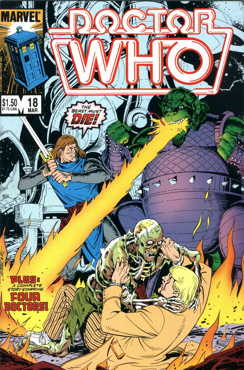
Issue 18 (March 1986)
The Front Cover
“The beast must DIE!” This is the first time we’ve had dialogue on the front cover since issue #11, and the immortal line is spoken by Sir Justin. This is really a packed cover – Sir Justin squares off against Melanchius, who is breathing fire in a sort of unspecific direction. We guess it’s there to provide a background for the second caption: “Plus: a complete story starring Four Doctors!” At the same time, though, the fire is creeping towards the fallen Doctor, who is fending off a living cadaver. Quite an action-packed illustration, really.
The Strips
“The Tides of Time” Part Seven
DWM‘s famous epic storyline finally comes to a close.
“Stan Lee Presents: Doctor Who: Timeslip” (“Timeslip” Parts One and Two)
The American comic finally finishes reprinting DWM‘s regular fourth Doctor strips. The two instalments aren’t indicated as separate parts, but the title caption for Part Two is retained. (Unusually, the “Originally presented in” caption is placed at the start of Part Two.)
“Twilight of the Silurians” (“Twilight of the Silurians” Parts One and Two)
Once again truncated, and once again featuring the fourth Doctor in season eighteen duds.
The Articles
“Recurring Evils Part I” (by Patrick Daniel O’Neill)
O’Neill recounts the histories of various secondary villains, including the Meddling Monk, the Yeti, and the Ice Warriors. Pretty basic stuff these days, if you’re at all familiar with the 60s era of the show. Illustrated with a full-page, coloured line drawing based on a publicity photo of Jon Pertwee with a Yeti.
The Columns
“The Editor’s Space” (by Jim Salicrup)
The esteemed editor reveals that “in a few issues [they’ll] be launching two new regular features.” In the meantime, he gives the addresses for several American Who clubs.
“Who Knows” (by Patrick Daniel O’Neill)
Confirmation is in that Colin Baker will return for the 23rd season, along with a listing of the next year’s Target output. There are more sightings of Who celebs on American television, but the series itself is being delayed from the national satellite transmission discussed in issue #15. Rounding out this month’s report are a recap of the events of July’s Panopticon New Orleans, and more fan club addresses. Illustrated with two panels of the fifth Doctor (from “Stars Fell on Stockbridge” part one and “The Tides of Time” part five), and one of the TARDIS (from an indeterminate strip).
“Who Cares”
Jennifer Garien of Jesup, Georgia, really likes the comic – but Anthony Padilla of Stillwater, Minnesota, hated nearly everything about issue #14. Bob Schaefer of San Antonio, Texas, thought “Junk Yard Demon” was a fantastic strip story, but wasn’t wild over “The Neutron Knights”; he admits, though, that things may be cleared up (as, indeed, they are) in “The Tides of Time.” He also thinks Patrick O’Neill should’ve gone lighter on his review of Doctor Who and the Zarbi (issue #13). J. Richard Godfrey, of Hillsboro, Oregon, wants to see a Dalek/Cybermen war, or a crossover with the Doctor meeting other Marvel heroes. All that and he doesn’t even know who Irving Forbush is! Illustrated with a coloured panel from “Stars Fell on Stockbridge” Part One (with some very, very different colouring for Max’s clothes).
The Adverts
“Six from Sirius 2” (four-issue Epic Comics miniseries);
“The Doctor Who Collection” (merchandise).
The Back Cover
“10 Reasons to Pick Up Marvel Age Every Month”.
Cool Colours
The Marvel TARDIS is blue with yellow windows and lamp, and orange light. In “Timeslip,” the fourth Doctor is coloured to match his season twelve and thirteen outfit of red coat and grey trousers, with a multicoloured scarf. K-9 varies between a dark and a very, very light gray. In the same story, the TARDIS console is purple with bright blue, pink, and yellow highlights! The first Doctor’s waistcoat ranges from light grey to purple, and the third Doctor wears his regular red smoking-jacket. The Silurians are light green with red eyes, and the dinosaurs they ride are light brown.
Fun Mistakes
This month’s “Who Knows” incorrectly identifies Louise Jameson’s wartime series as Tanks (in issue #16 it was correctly called Tenko). Patrick Troughton, as well, is said to be starring in PBS’ Wonderworks series in December; that was, in fact, merely a weekly showcase for ‘family’ fare, often imported (such as the BBC’s The Chronicles of Narnia) – the program starring Troughton was The Box of Delights. The “Recurring Evils” article lists the Yeti as “one of a number of creatures involved in The War Games “brought together by the War Chief and the War Lord”, which implies something quite different from their actual cameo.
Conclusion
More jam-packed-ness. The quality is a little lower this time, with less of the regular Doctor strip (“Timeslip” is hardly fantastic), but overall it’s good stuff. Next month, sadly, will be Dave Gibbons’ last.
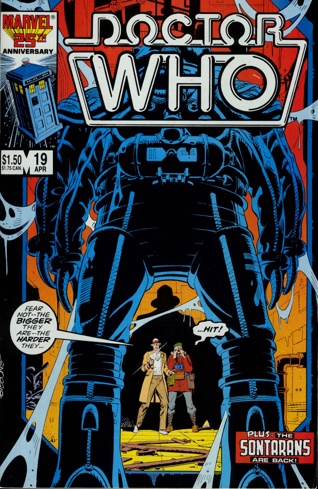
Issue 19 (April 1986)
The Front Cover
This is, sadly, the very last Dave Gibbons cover. It’s nice, but ultimately, not one of his best. Oddly reminiscent of his issue #14 cover (for “Clash of the Neutron Knights”), the Doctor and his ally (this time, Max) are very much in the background, dwarfed by the massive figure of the alien astronaut. For the first and last time, both protagonists have dialogue on the cover, essentially completing each other’s thoughts: “Fear not – the bigger they are – the harder they -” “-Hit!” The latter being Max, of course. This issue also introduces a detail seen on the remaining covers: the “Marvel 25th Anniversary” logo over the TARDIS, instead of the simple black “MARVEL”.
The Strips
“Stars Fell on Stockbridge” Parts One and Two
Just like “The Tides of Time,” both parts retain their captions. This is the last appearance of Dave Gibbons’ art in the comic, and is probably one of the best-coloured of the series, thanks to many light effects.
“The Touchdown on Deneb 7”
A bizarre little K-9 story. In this strip and the next, the Doctor is back to being coloured ala season twelve, with a red coat and multicoloured scarf (just like the previous issue’s “Timeslip”).
“The Outsider” (“The Outsider” Part One)
The return of the Sontarans was hyped on the cover, but it wasn’t really much to crow about. Four pages of Sontaran fun does not a party make!
The Articles
“Recurring Evils Part II”
O’Neill presses on to the returning monsters of the ’70s and ’80s, including the Autons, the Silurians, the Sea Devils, Aggedor, Omega, the Sontarans, the Rutans, the Black and White Guardians, and the Mara. Illustrated with a colour-tinted black-and-white photo from “The Silurians” (now featuring a green Silurian, orange dead UNIT soldier, and purple background – oooh!), and a black-and-white photo each of Linx (from The Time Warrior) and a Sea Devil (from the eponymous story).
The Columns
“The Editor’s Space” (by Jim Salicrup)
Salicrup takes the time to thank outgoing artist Dave Gibbons for his immense contributions, going so far as to suggest that “if the BBC ever needs to replace Colin Baker, they need look no further than Dave Gibbons.” Now that’s a testimonial!
“Who Knows” (by Patrick Daniel O’Neill)
Details are given for a USA Today article about the hiatus, as well as notes on Peter Davison’s recent Magnum, PIappearance, and Colin Baker and Frazer Hines’ upcoming play. For the first time, O’Neill also takes some space to answer questions from readers, this issue focusing on debate over his “Probable History of the Daleks” (issue #9). Illustrated with a small colour graphic of the TARDIS, a cartoony graphic of a blue Dalek (with lots of red “Exterminate”s) and a large pink stripe?
“Who Cares”
Edward A. Rozanski of Philadelphia, Pennsylvania, would like to see polls conducted in the comic, and has a few salient thoughts on the hiatus. Allen Lane of West Milford, New Jersey, likes the new neon tube logo, and gives address for the Prydonians of Princeton and Jersey Jagaroths (?!) clubs. Mark Hunt of Tulsa, Oklahoma, didn’t like “The Neutron Knights” and, indeed, most of issue #14; he wants to know if the Doctor will meet Abslom Daak, and if there will ever be annuals. Michael Toth has found an interesting, er, Autonal link between Doctor Who and Planet Terry, while Andersen Silva of Patterson, New Jersey, wants to clue fans in as to where they can buy a fourth Doctor scarf, and likes the Absolm Daak and Kroton stories. Ted Wynde (no address) has picked up on the Delgado typo in issue #15, and Brad Huppert of Prescott, Wisconsin, is eager to see Colin Baker strips make the jump to the American comic.
The Adverts
“Doctor Who Conventions”;
“Doctor Who Giftshop”, with two illustrations: one of the fourth Doctor (in a light brown outfit, with multicoloured scarf), the other of two Daleks (one blue, one red).
The Back Cover
“10 Reasons to Pick Up Marvel Age Every Month”.
Cool Colours
The Marvel TARDIS is light blue with a bright blue side and roof (oookay!), yellow windows and red lamp. Maxwell Edison may be the worst fashion offender ever: he wears an orange check shirt, a green tie, a blue sweater, and a red parka with gray lining. He also wears a dark green beret. Errgh! The effect of darkness means many of the panels of “Stars Fell on Stockbridge” are coloured in shades of grey and blue (including one, on page 8, that will later be adapted for a full-colour flashback in issue #22) – two, however, remain mostly black and white (with only small colour details). As in the previous issue’s “Timeslip”, the fourth Doctor in “Deneb-7” and “The Outsider” is wearing what looks to be his season twelve outfit. The robots of Deneb-7 are each a different shade of orange or yellow.
Fun Mistakes
In the “Editor’s Space,” Jim Salicrup doesn’t seem to know the meaning of “nihilistic” (or else, he simply likes the way it sounds when teamed with “nineteenth”). Despite the lighting effects in “Stars Fell on Stockbridge,” there are at least two panels where the Doctor’s coat is coloured a dark olive, and probably shouldn’t be (his hair and skin remain light).
Conclusion
The back-up strips may not be wildly wonderful, but the main strip is (it’s one of our personal favourites). This is the last we’ll see of Dave Gibbons’ art in the comic, and it will definitely be sorely missed. As if in tribute, the colouring on “Stars” is probably the best of the entire 23-issue run. Overall, the issue may not be on the quality level of those containing “Tides of Time”, but it’s still pretty darn great. Had the eventual cancellation of the comic been known at the time, this would’ve been a perfect issue to end on.
Issue 20 (May 1986)
The Front Cover
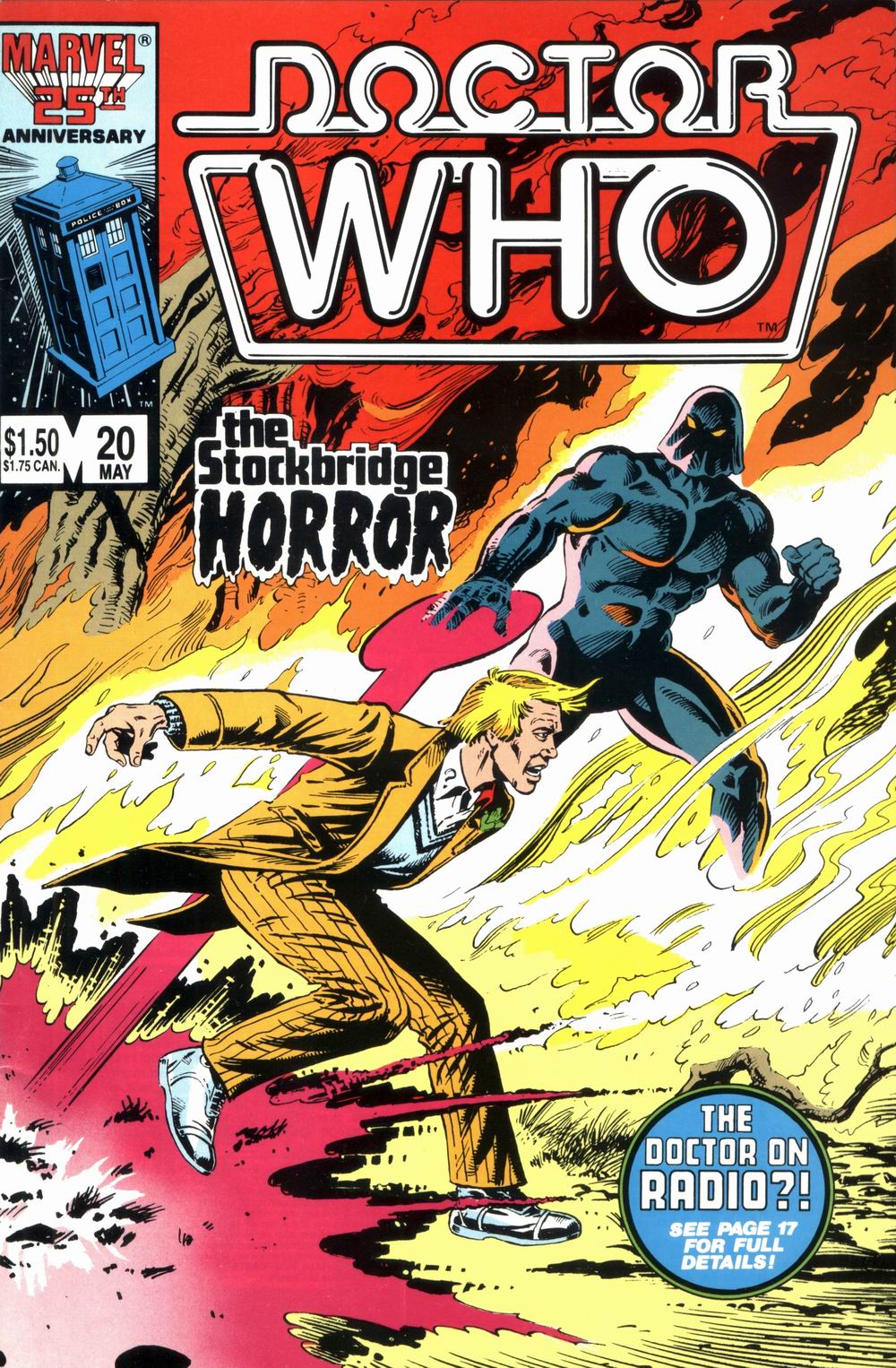
“The Stockbridge Horror”. Steve Parkhouse and Paul Neary provide their first cover, of the Doctor running to escape the fire and the being causing it. Although the proportions and design of the cover are just fine, Davison’s features are badly captured, not looking at all like the actor. A caption circle at the bottom directs us towards a newsworthy item: “The Doctor on Radio?! See Page 17 for Full Details!”
The Strips
“The Stockbridge Horror” (“The Stockbridge Horror” Parts One and Two)
Both instalments have been edited together, without any captions or indication of a break between the two.
“The Outsider” Part II
“The Greatest Gamble”
An odd choice for inclusion in the American comic, since most Stateside fans would not recognize the Celestial Toymaker
The Articles
“The Doctor Who Bookshelf” (by Patrick Daniel O’Neill)
Reviews of three books: Peter Haining’s The Key to Time (“Between this title and Haining’s previous work, if there’s anything about the program’s history you still need to know, I’d be surprised.”), Terrance Dicks’ The Doctor Who Monster Book (“a nice, glancing overview of the first 12 seasons”) and John Lucarotti’s Target novelization of his own Marco Polo (“one of the best new releases from Target”). O’Neill loves his books!
The Columns
“The Editor’s Space” (by Jim Salicrup)
Salicrup’s space is given over to welcoming new cover artists Steve Parkhouse and Paul Neary.
“Who Knows” (by Patrick Daniel O’Neill)
More details on the show’s 23rd season, including the revelation that there will only be fourteen episodes, and “the first and last adventures [will] be written by Robert Holmes, with the last titled Gallifrey.” Also detailed are the summer broadcasts of the six-part radio drama Slipback, and a pitch for the 1986 North American Time Festival in St. Louis, Missouri. Illustrated with a black-and-white panel of John Ridgway’s sixth Doctor art (with a pink question mark superimposed over), and a stylized colour illustration of a radio with a cartoon speech bubble ‘containing’ the same incarnation.
“Who Cares”
Tim Scharr of St. Peters, Montana, likes the comic, but doesn’t understand what a “logo” is. Jerry Ferraccio of Temple, Arizona, and Steven Bottos of Ontario, Canada, also enjoy it, but the former takes Patrick Daniel O’Neill to task over a few things. Jon Hunt of Crystal, Michigan, actually prefers the lighter paper and darker colours of the Marvel Premieres, and would like to see Marvel change the format. John Kaluta of Col Heights, Michigan, and John (The Doctor) Poppos of North Adams, Montana, both just adore the mag. Tom Nerwinski of Marrisville, Pennsylvania, is worried the show is being cancelled. Bill Cuthbertson of Layton, Utah, wants to see the comic run the Davison strips “4-Dimensional Vistas” and “The Moderator” – sadly, the comic will later end with issue #23, when #24 would’ve included the start of “Vistas.”
The Adverts
“The Boxx Chronicles” (six-issue Epic Comics miniseries);
“Miranda the She-Wolf” (a Marvel graphic novel);
“The Doctor Who Collection” (merchandise).
The Back Cover
“10 Reasons to Pick Up Marvel Age Every Month”.
Cool Colours
The Marvel TARDIS is probably the best it’s been so far – all blue, but for light blue windows and light, and white lettering. The title caption for “The Stockbridge Horror” is a bright pink. The TARDIS console is predominantly purple. Clearly Andy Yanchus has some publicity photos to go by, though: the Celestial Toymaker’s robes are black/blue with yellow and a couple red highlights.
Fun Mistakes
The assumption that Haining’s Key to Time is a seminal reference work, or in fact especially factual, is rather a mistake. O’Neill refers to “Barbara and her young Chinese friend Ping-Cho,” when he in fact is referring to Susan and her friend.
Conclusion
Another good issue, but we miss Dave Gibbons’ art. Parkhouse’s art is certainly acceptable, but lacks that certain something that Gibbons provided. Thankfully, at least one of the back-up strips is worth reading.