
A (short) History of Typefaces
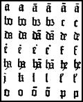
Example of some of the earliest fonts created by Gutenberg.The invention of movable type is often attributed to Johannes Gutenberg, even though the Chinese had used something similar over two centuries before him. What is generally agreed is that the printing of the Gutenberg Bible in 1454 revolutionised forever the way information was shared.
The printing press used mirror images of letters, aligned to make printing plates and then inked and pressed onto paper to mass produce books and pamphlets. Gutenberg’s first typefaces resembled the calligraphic writing of the time and similar to Old English Blackletter styles seen today. The typesetting technology spread very quickly across Europe and the process itself remained unchanged for centuries, although thousands of printer’s variations in typefaces abounded.
The Industrial Revolution brought first steam and later rotary press systems, followed by improvements in typesetting by Linotype and Monotype machines allowing the type to be set much quicker and reused. Also in the late 1800s the ‘point’ system for defining type size was adapted, putting approximately 72 points to the inch.
By the 1950s typesetting had progressed to a photocomposition format. Using film to project characters onto photo-sensitive paper and lenses used to adjust size. Then, in 1961, Letraset was formed and began to sell dry transfer typefaces at extremely low costs. Many of these typefaces became well known, and have been recreated digitally using the familiar Letraset names.
Computer fonts have also morphed over the last three decades. Like many early systems, each developed their own proprietary formats for fonts. By the late 1980s, PostScript emerged as the leading standard for most computer systems and later, with the proliferation of Windows based systems, Truetype fonts also gained a foothold. Both of these types of fonts are still widely used today. In 1996, Microsoft and Adobe announced a collaboration to create a new electronic font standard. OpenType (as the new standard was called) can contain either PostScript or Truetype information so it can easily be shared between various operating systems.
One final point: a typeface is the design of characters and a font is one particular weight, width and style of a typeface.
Fonts in Doctor Who
Over the years, Doctor Who has used many typeface styles, generally used to compliment logos or for thematic presentation of opening and closing credits. This guide, while not strictly a list of the original fonts used in the series, will try to indicate the current closest ‘digital’ representation. Often the original Letraset typeface has been adapted into an electronic version. Doctor Who has actually used some fairly standard fonts over the years, in particular, the Futura typeface has been used at various times. The fonts used in Doctor Who lend an important ambiance and distinctiveness to each era of the series. Other brand typefaces are used to easily catch the attention of the public and have them recognize products or advertisements as relating to the series (such as the current use of Deviant Strain to ‘brand’ all the new series products).
The bulk of the guide is broken up into ‘Series Opening and Closing Titles‘ and ‘Series Logos‘. A quick guide to some of the typefaces used on the merchandise is below.
The guide will point out the closest electronic equivalent currently available, and where possible the original Letraset version many of the fonts used in the series were based on. Where there are various ‘lookalike’ or similar typefaces available that will be noted as well. Background information on each typeface is also provided. Finally, a link to purchase the fonts described is provided.
Typefaces are protected software and most of these fonts are available to purchase at extremely reasonable prices. Trading of font files, or posting commercial fonts online is not sanctioned by the author or this site. Please support the foundries that developed these fonts!
Merchandise Typefaces (Selected Guide)
| Font | ||
|---|---|---|
| Target Novels: Doctor Who and the Daleks – Doctor Who and the Enemy of the World | Title | Futura Condensed ExtraBold |
| Spine | Swiss 721 | |
| Back Cover | Swiss 721 Heavy | |
| Target Novels: Doctor Who and an Unearthly Child – Doctor Who: The Pescatons | Title | Futura Condensed ExtraBold |
| Spine | Futura Condensed ExtraBold | |
| Back Cover | Franklin Heavy Gothic | |
| Target Novels: Blue Spine Reprints | All | Veritas Black Condensed |
| Pinnacle Novels | All | ITC Serif Gothic Extra Bold |
| The New Adventures 1-49 | Title/Spine | Futura Book |
| Back Cover | Futura Condensed | |
| The New Adventures 50+ | Title/Spine | Copperplate Gothic 33BC |
| Back Cover | Helvetica 55 Roman | |
| The Missing Adventures | Title/Spine | Gill Sans Bold |
| Back Cover | Futura Book | |
| BBC Past Doctor and Eight Doctor Adventures | Title/Spine | Industria Solid |
| Back Cover | Lucida Sans | |
| BBC Books New Series Adventures | Title/Spine | Deviant Strain |
| Back Cover | ITC Conduit Medium | |
| Telos Novellas | Title | ICC Timelord |
| Videos 1983-1996 | Title/Spine | VAG Rounded Bold |
| Back Cover | Helvetica 65 Medium | |
| Video: The Movie | Back Cover | Gill Sans Condensed |
| Video: The Green Death | Title/Spine | Badloc |
| Back Cover | Verdana | |
| Videos 1997-2003 | Title/Spine | Industria Solid |
| Back Cover | Lucida Sans | |
| DVDs: Classic Series Regions 2/4 | Title/Spine | Futura Poster Display |
| Back Cover | ITC Conduit Medium | |
| DVDs: Classic Series Region 1 | Title/Spine | Industria Solid |
| Back Cover | Gill Sans | |
| DVDs: Ninth and Tenth Doctor | All | Deviant Strain |