Doctor Who
Issue 1 (October 1984)
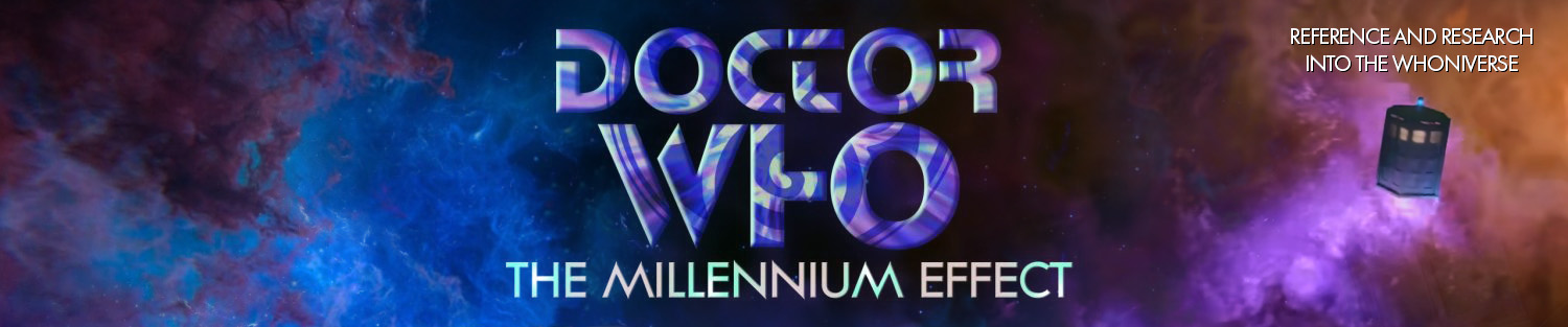
The Front Cover
“1st Collector’s Item Issue”! The first of the Dave Gibbons covers, which began the pattern of the same artist drawing both the reprinted feature comic and exclusive new cover art for the same issue. This is a really fun one, with the Doctor, Sharon, Fudge, K-9, and Beep surrounded by Wrarth Warriors. Also making its debut with this issue is the Gibbons-drawn Marvel TARDIS for the corner box. Text at the bottom of the picture elaborates what we’ll find inside – “Beginning: The Star Beast Saga! Plus: The Return of the Daleks!” Ooooh’.
The Strips
“Doctor Who and the Star Beast” Part One (“The Star Beast” Parts One – Three)
Choosing to skip over “Timeslip” for now, the editorial team is probably banking on both a bigger, longer story, and the recognisable Dave Gibbons art.
“The Return of the Daleks” (“The Return of the Daleks” Parts One – Four)
Strangely, more pages are given over to present this back-up strip in its entirety than to run the featured ‘Doctor’ strip. For the first time, the recaps of the back-up strips are handled by removing the Doctor panel entirely and centring the next panel on the page. This creates a very stilted edit between the Part One and Part Two material: two panels essentially show the same action, and the second has a recap caption for no apparent reason.
The Articles
“Who’s Who” (author uncredited, illustrations by Walter Simonson)
Another of the potted history articles, focusing mostly on the different incarnations of the Doctor (including Cushing). Four of the five illustrations from Marvel Premiere #60’s “Hello, Goodbye, Hello” article accompany the item (the Fourth Doctor and Romana cartoon, the Fourth Doctor and Zygon cartoon, the Sarah Jane portrait, and the Peter Davison portrait), although the Zygon one is missing its original caption and speech bubble.
The Columns
“Introduction” (by Jim Salicrup)
Getting off to a slow start, the editor introduces us to the new comic. At the end is a cartoon parodying Peanuts character Lucy’s ‘Advice 5 cents’, by an unknown artist.
The Adverts
“10 Reasons to Pick Up Marvel Age Every Month”.
The Back Cover
Another splendid piece of art by Dave Gibbons, showing a close-up of the Doctor with a starscape and characters from “The Star Beast” around him. This same piece of art – albeit in black-and-white, with the comic logo at the top – was also used as a promotional poster for the comic’s debut.
Cool Colours
The Marvel TARDIS – now featured in the top left corner of every cover – is bright blue, with a white light, windows, and ‘Police Box’ lettering, and a purplish-blue base. The Wrarth Warriors are very green, and Beep the Meep is bright blue, with purple hands and feet. The Anhautans in “Return of the Daleks” are orange-skinned. As shown on the front cover, the Doctor’s scarf is made up of all kinds of bright, bright colours (including a rich yellow and bright blue). Also on the front cover, his coat (for the first and only time) is seen to be the same dark brown as his waistcoat and trousers. On the backcover, although he is clearly wearing the season 17 outfit, the Doctor’s coat lapels and cuffs are bright red and his tie is green with yellow spots.
Fun Mistakes
“John Nathan-Turner promises [that Colin Baker’s Doctor] will be a gentle clown, in something of a return to the Troughton image. Colin Baker’s first story aired this spring in Great Britain, and should be available for viewing in the U.S. next year.” Obviously the writer didn’t see it…
Conclusion
A zippy little first issue, but the evolution from this to the final issues of the reprint comic is pretty dramatic. The articles and columns are barely existent, and this is the only time a multi-part back-up strip is printed entirely within one issue. However, already we are seeing improvements over the Marvel Premieres: the cover art is much better, the paper and art duplication are far and away of a higher quality. With this issue the comic is printed on Baxter paper – Baxter paper is a high quality, white, heavy paper used in the printing of some comics. Also the laughable Marvel ads (“Buy Hostess Fruit Pies!”) are nowhere to be seen. A good start.
Issue 2 (November 1984)
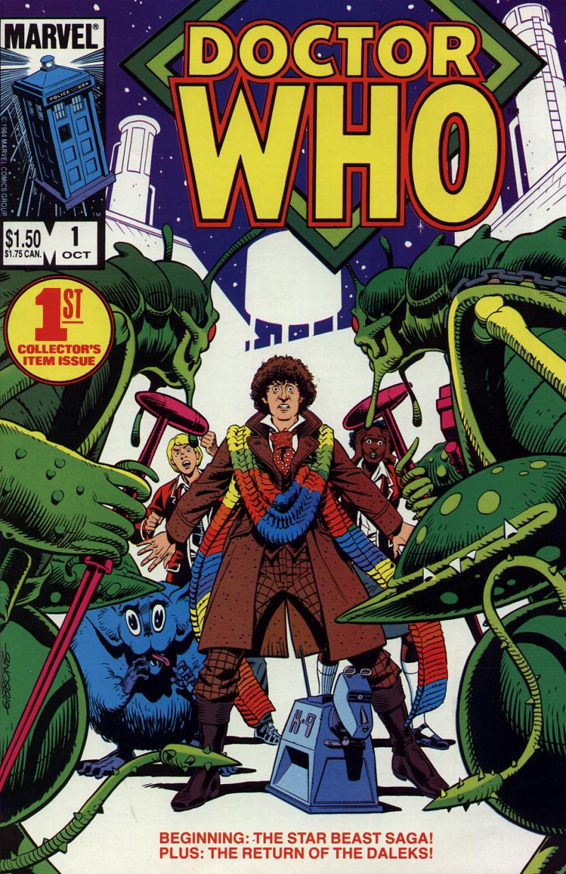
The Front Cover
“The Thrilling Conclusion to” ‘Star Beast!'” A bigger, bolder graphic representation of the cliffhanger to part six of “The Star Beast”. Sharon has forced the Doctor off the scaffolding, and they fall through the air as Beep the Meep watches on. Good stuff, and the Doctor’s scarf isn’t quite so blazingly bright this month.
The Strips
“Doctor Who and the Star Beast: Revenge of Wrarth!” (“The Star Beast” Parts Four – Eight)
The splash page from the beginning of part five has been retained, thus giving its title and credits to the entire twenty-one pages.
“Throwback: The Soul of a Cyberman” Parts One and Two
Although the “Throwback: The Soul of a Cyberman: Part One” and “Part Two” captions have been kept, part two’s Doctor recap has been removed.
The Pin-Ups
Three of Cockrum and Giacoia’s pin-ups from Marvel Premiere #57 make a return: “The TARDIS and K-9”, “The Doctor’s most fearsome foes!”, and “The Daleks”. So where is “The Five Doctors”? Stay tuned!
The Adverts
“10 Reasons to Pick Up Marvel Age Every Month”.
The Back Cover
“The Five Doctors” by Cockrum & Giacoia, as originally seen in Marvel Premiere #57.
Cool Colours
The Marvel TARDIS is entirely bright blue – body, windows, and base. It does have a white light, though, and retains the white ‘Police Box’ lettering.
Conclusion
A good issue, almost entirely filled with comic content. It’s amusing to note that, while the colouring sometimes leaves something to be desired in these early days, we actually get a lot more comic pages per issue than in later ones, filled with letter columns and factoids and the like.
Issue 3 (December 1984)
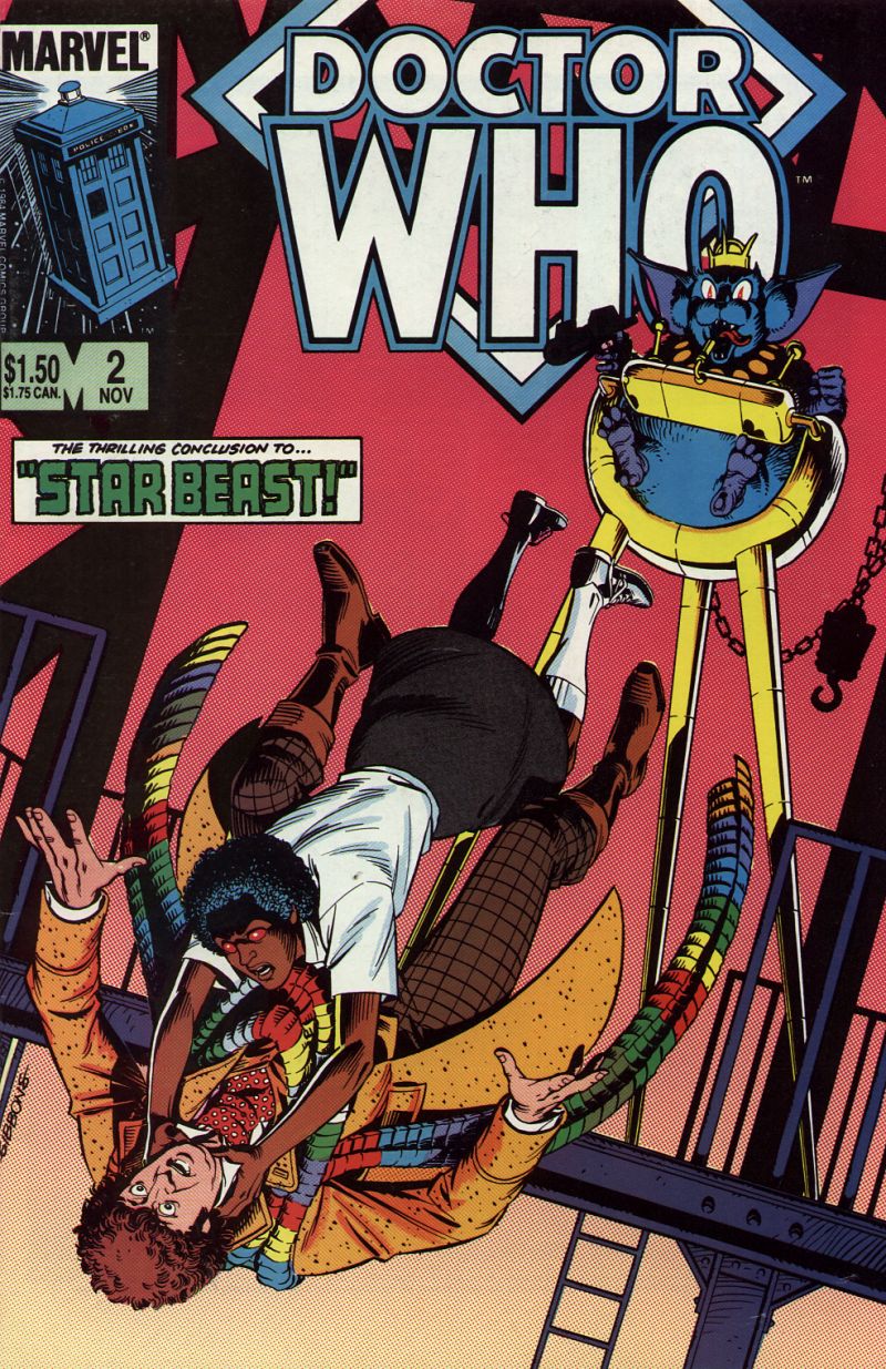
The Front Cover
“The Doctor isn’t himself today'” A great cover by Dave Gibbons shows the Doctor’s metamorphosis into a Werelox. It’s a really fantastic piece of art, one of the best in the series.
The Strips
“Doctor Who and the Dogs of Doom” Part One (“Dogs of Doom” Parts One – Four)
“Throwback: The Soul of a Cyberman” Part Three
“The Final Quest”
They’re just working their way down the line of popular villains in the back-up strips, aren’t they? First the Daleks, then a Cyberman, now a Sontaran.
The Articles
“The Fans of Doctor Who” (by Patrick Daniel O’Neill, illustrated by Walt Simonson and others?)
O’Neill interviews prominent American fans Jean Airey and Gail Bennett, the secretary / treasurer and president of the North American Time Festival Board, respectively. They discuss American Doctor Whoconventions, Bennett making a point that she’s “never seen a distinction in fan groups based on any kind of race, religion, sex, handicap, or length of time as a fan”. Mention is also made of how fans can keep up with the latest news, and how to encourage their local PBS station to run the show. The piece is illustrated with a re-coloured version of Simonson’s Marvel Premiere #57 cover, and the Leela and UNIT illustrations from Marvel Premiere #60.
“The Doctor Who Bookshelf” (by Patrick Daniel O’Neill, illustration by unknown)
Reviews of three Doctor Who-related books: The Doctor Who Technical Manual, (headlined as “Build Your Own TARDIS”, with appropriate illustration from the book), Doctor Who: The Unfolding Text (headlined as “Deep Scholarship, with photograph of cover), and Doctor Who: A Celebration – 20 Years Through Time and Space (headlined as “Celebrating Two Decades”, also with cover photograph). Clearly O’Neill intended to be read in a different order than printed, as The Unfolding Text begins, “The last of this trio”, and yet is clearly only the second of the two. Naturally, he recommends all three to readers. The uncredited illustration at the beginning depicts the Doctor and a bunch of flies (?) reading a pile of books, including “The Bronze Age of Ballooning”, “The Lizard of Oz!”, “Socks Can Be Fun”, and “200 Dalek Jokes to Amuse Your Friends”; the style clearly indicates the artist as being the same who drew the Peanuts-style cartoon for issue #1.
The Columns”Introduction” (by Jim Salicrup)
That zany Jim Salicrup is back! He recaps the comic’s purpose for those of us not in the know, before moving on to a discussion of his meeting with Dave Gibbons. He relates how he wasn’t a fan when he started editing the comic, and how their resident expert – Patrick Daniel O’Neill – insists that the Doctor never be referred to as “Doctor Who” or “Dr.”. Maggie Thompson, co-editor of The Comic Buyer’s Guide, told Salicrup that nine actors have played the Doctor – obviously she’s a time-traveller from post-1996 (and before you mention it, Peter Cushing was cited earlier in the introduction as if he played an entirely separate character named “Doctor Who”).
“Who Cares”
The comic’s regular letters column starts rather inauspiciously, with two letters. The first, from Matt Haverstick of Pennsylvania, recommends they get as many old monsters in the comic as possible (he thought DWM “was best when the Ice Warriors and the Meddling Monk appeared”; you mean someone liked “4-Dimensional Vistas”?), keep TV companions in, and “experiment with various portrayals of the Doctor”. Oh, and he’d “like to see Logopolis or Terror of the Zygons in [the] new comic.” Sherry Daynard of Ontario, Canada, takes the editors to task for advertising the Doctor in Marvel Age Magazine as a “jelly bean eating time traveller.” Tsk!
The Adverts
“Timespirits” (from Epic Comics),
“Subscribe to Doctor Who: The Magazine of Time and Space”;
“10 Reasons to Pick Up Marvel Age Every Month”.
The Back Cover
A black background, against which is set a black, yellow and red version of the diamond logo (very stylish it is, too).
Cool Colours
The Marvel TARDIS is a little wonky today. One side of the thing is pale blue, including the windows, but the five panels are bright blue. The other, shadowed side, the base, and the stacked roof are all bright blue. The lamp’s casing on top is pale blue, and the lamp is an even paler grey-blue! It’s just bizarre’. Similarly odd is that while the Doctor transforms on the front cover, so does his coat; the regular Doctor seems to be wearing a yellow coat, the hairy Doctor a peach coat, the really hairy Doctor a mustard-coloured coat, and the werewolf Doctor a bright orange coat. The Doctor’s eyes are clearly brown (going against both the back cover of issue #1 and Tom Baker’s real eye colour). At the end of the “Dogs of Doom” material, the red Dalek appears to have a partially pink grill. Sharon’s uniform is yellow with red piping.
Conclusion
The sign of things to come. The “Who Cares” letter column and Patrick Daniel O’Neill’s factual articles make their debut alongside what is probably the worst of the Tom Baker strip stories. Not the best issue, but not the worst either.
Issue 4 (January 1985)
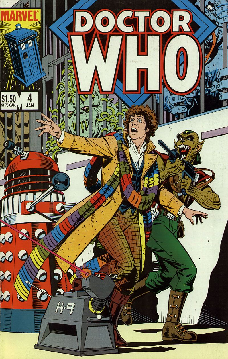
The Front Cover
A special wraparound cover, without any captions at all! The Doctor looks on in horror as K-9 frees the beasts from their Dalek prisons (basically, a large-scale version of part six’s cliffhanger). Brill and the Daleks also feature. Really nice and very eye-catching.
The Strips
“Doctor Who and the Dogs of Doom: The Dalek Masters” (“Dogs of Doom” Parts Five – Eight)
“The Stolen TARDIS: A Tale of the Time Lords” (“The Stolen TARDIS” Parts One – Three)
The same technique is employed as with “Throwback”; the “Part One”, “Two” and “Three” captions are retained.
The Columns
“Introduction” (by Jim Salicrup)
Salicrup finishes his story of meeting Dave Gibbons, as begun in the previous issue. He also talks a bit about the writing team of John Mills and Pat Wagner, regarding their policy on the writing partnership, as well as the thrilling news that “one of our very own Doctor Who scribes will be writing for the Doctor Who television program!” Er no, they won’t. There’s a little illustration at the bottom to remind us “Next time: The Time Witch!”. Quite.
“Who Cares”
Ooh, the natives are opinionated today. A. T. Barone of New Jersey is quite pleased with the comic’s portrayal of Tom Baker’s Doctor, and wants a checklist of companions. Ben Camburn of Pennsylvania would like some comic adaptations of episodes featuring Sarah Jane or one of the Romanas, and thinks a comic of “The Five Doctors” would be great for a comic annual. “Lady Jennika” of California has some very strong feelings: “Dave Gibbons has all the artistic capability of a gibbon”, it would seem, and she would prefer someone “who can draw Tom Baker competently”. If this cannot be arranged, she’d like “Mr. Gibbons [to] meet a Dalek in the dark”! The editorial team, naturally, disagrees with her. Finally, Michael Thompson of Ontario, Canada, would prefer they use the “new neon tube logo”, and run some strips starring Peter Davison or Colin Baker’s Doctors. The whole thing is accompanied by a panel from “The Star Beast”, featuring a Wrarth Warrior and some dialogue from the Doctor and K-9.
The Adverts
“Timespirits” (from Epic Comics),
“Subscribe to Doctor Who: The Magazine of Time and Space”;
“10 Reasons to Pick Up Marvel Age Every Month”.
Cool Colours
Thank heaven, it’s a normal Marvel TARDIS. The whole thing is bright blue, with white windows, lettering, and lamp (which seems, strangely, to give off yellow luminescence). On the front cover, the Doctor’s waistcoat is blue (it’s totally dark in the inside comic). As we failed to mention last issue, the President would seem to be of African descent. The Daleks are led by a red Dalek, instead of the more traditional black or gold. In “The Stolen TARDIS”, Sillarc is lime green with a purple uniform.
Conclusion
A very content-heavy issue; Dave Gibbons’ only wraparound cover is wonderful, so it’s a shame that “The Dogs of Doom” and “The Stolen TARDIS” are such lacklustre tales.