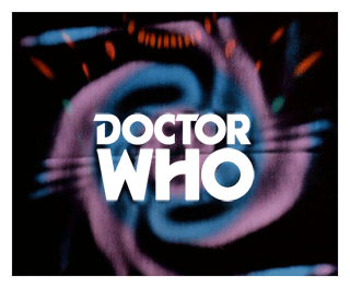
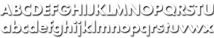
Most of the logos used throughout the series have been more graphic design than straight use of typefaces. This page of the guide will therefore be more abstract, but we will try to give indications when the logo is based on an obvious typeface. We will also note variations that are noticeable from the letters seen in the logo.
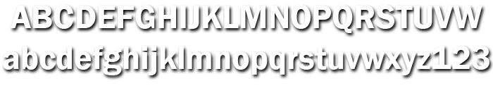
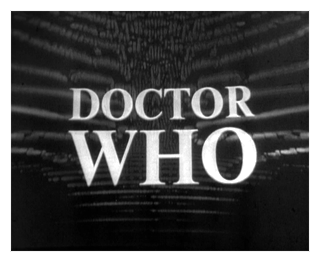
Franklin Gothic (variant unknown)
An Unearthly Child – The Moonbase Episode 4
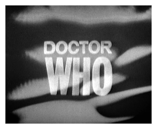
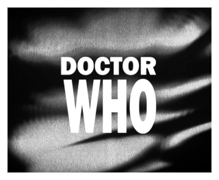
Whilst the first logo for the series displays many characteristics that point to a variant of Franklin Gothic there are a few aberrations, However, this seems to be the closest match available.
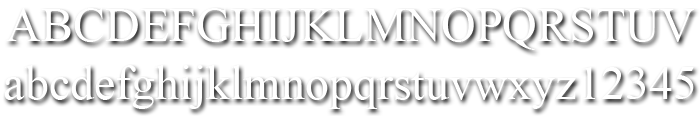
By 1915, all the major foundries offered families of sans serifs, sometimes called Gothic in the USA. Franklin was a response suitable for countries in the vanguard of the machine age. Designed by Morris Benton in 1903-1912, Franklin has preserved its own personality ever since. The ITC Franklin Gothic font family is a redrawing by ITC that keeps the original strength intact, meeting the demand for a strong typeface. ITC Franklin Gothic is better read in display sizes and considered a standard in the newspaper and advertising fields.
Update: Research in 2020 by Clayton Hickman proposes the following:
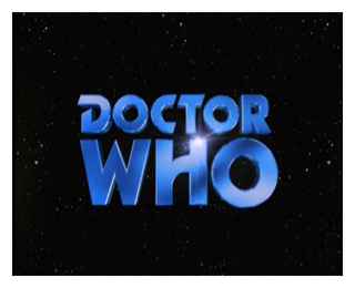
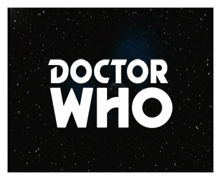
DOCTOR as Venus Extra-Bold Extended by Bauer (1907) / Modern equivelant Venusian Ultra NF by Nick’s Fonts (2014)
or Aurora Grotesk by CE Weber (1912) / Modern equivelant Annonce by Canada Type (2006)
WHO: Grotesque No. 9 by Stephenson Blake (1906) / Modern equivelant Grotesque No. 9 by URW (2000)
The C is an ‘O’ with a section cut out, and the crossbar of the T has been trimmed.
Times (variant unknown)
The Macra Terror Episode 1 – The War Games Episode Ten
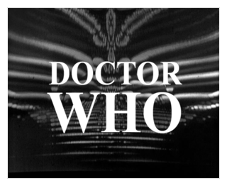
This logo, although distorted by the video feedback effects, is still recognisable as a variant of Times (or Times New Roman).
Times New Roman first appeared in 1932 in The Times of London newspaper, for which it was designed. It has subsequently become one of the world’s most successful type creations. The original drawings were made under Stanley Morison’s direction by Victor Lardent at The Times. It then went through an extensive iterative process involving further work in the Monotype Type Drawing Office. Based on experiments Morison had conducted using Perpetua and Plantin, Times New Roman has many old style characteristics but was adapted to give excellent legibility coupled with good economy. The Times New Roman font family is narrow in relation to its apparent size, and is strong in color with a crisp and clean appearance. Both Times New Roman and its condensed companion combine vertical and diagonal stress, but achieve utility and even color by a logical and skilful manipulation of both weight and condensation. Widely used in books and magazines, for reports, office documents and also for display and advertising.
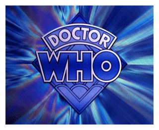
Timelord Solid
This logo is artwork using a variation of the Futura font.
The C is the standard C from Futura Bold, rather than the one in Timelord Solid.
Timelord was created for Telos publishing’s line of DOCTOR WHO novellas by Comicraft. This logo is a variation of the Futura family. The font set contains two versions each of the letters B, D, P, & R; one version with a solid stem and another with an open stem. The capital C does not match the logo font.
Futura Bold
The Time Warrior Part One – The Horns of Nimon Part Four
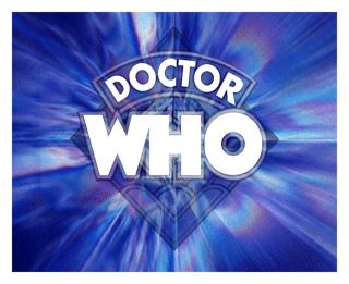
This logo is artwork using a variation of the Futura font.
The capital W is an artwork variation in the original logo. The W from Timelord Solid is a closer match, but not entirely accurate.
Futura was designed by Paul Renner in 1927, at a time when sans serif faces were advocated for universal acceptance. Futura is based on strict geometric shapes, which give an overall effect of simplicity and clarity. Futura became extremely popular first in Germany and eventually in the USA. Futura is a sans serif font based on geometric shapes which became an integral part of the Bauhaus movement of the 1930s. Some researchers have identified the Futura letterforms as Constructivist, probably due to the circles and straight strokes which coincide with the Bauhaus design school concepts, when the whole thinking was industrial. Form and function became the key words, unnecessary decoration was scorned. Issued by the Bauer Foundry in a wide range of font weights and widths, the Futura font family became a popular choice for text and display setting.
Unavailable
The Leisure Hive Part One – The Trial of a Time Lord Part Fourteen
The original logo is artwork based on the Formula One font used for the series titles at the time.
Time and the Rani Part One – Survival Part Three
Logo is artwork, no equivalent font available a this time
Timelord Solid
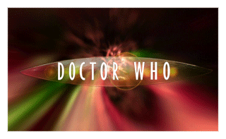
Doctor Who (The TV Movie)

This logo is artwork using a variation of the Futura font.
The C iin this logo is different from the Pertwee version. This C matches the Timelord Solid typeface.
Timelord was created for Telos publishing’s line of Doctor Who novellas by Comicraft. This logo is a variation of the Futura family. The font set contains two versions each of the letters B, D, P, & R; one version with a solid stem and another with an open stem. The capital C does not match the logo font.
Platform One
Rose – The End of Time, Part Two
Platform One is a fan produced typeface based on Gill Sans Extra Condensed, which is only available commercially in a Bold variant. The leg of the R in this font set is curved, but in the logo artwork this has been straightened. In Platform One the letters K, P and R have been modified to match the typeface used in the logo.