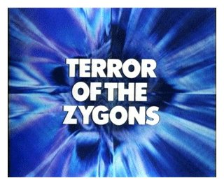
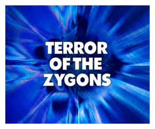
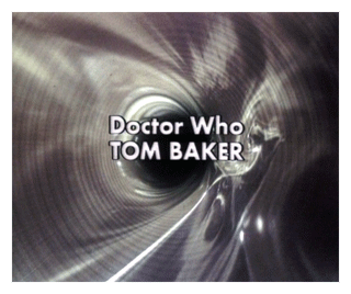
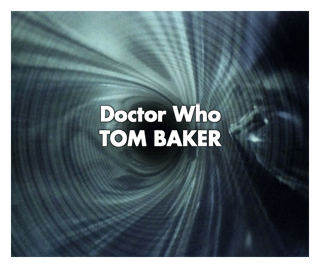
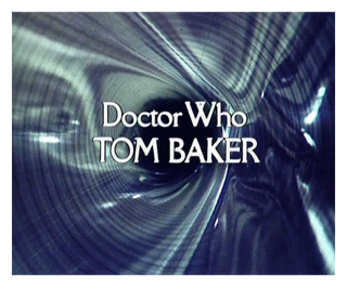
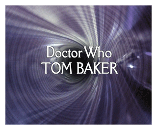
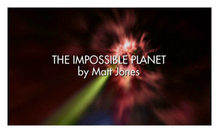
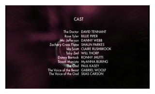
Bureau Grotesque One-Three
An Unearthly Child – The Savages Episode 4,
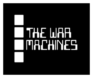
The War Machines Episode 1 – The War Machines Episode 4 [closing titles only]
The Smugglers Episode 1 – The Smugglers Episode 4
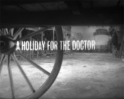
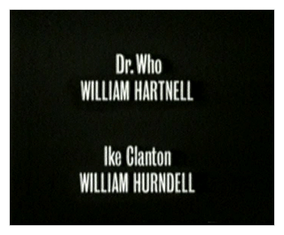
The Bureau Grotesque font was released in 1989 and designed by Jonathan Hoefler and David Berlow.
Wotan
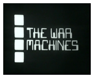
The War Machines Episode 1 – The War Machines Episode 4 [opening titles only]
A special one-off font was used for this serial to highlight the computer aspect.
Wotan is a fan-produced font.
There is no known commercially available equivalent for the special typeface used for the opening titles of The War Machines. However, there are several fonts in the same style, but all are incorrect, such as Data 70 and Computer.
Eurostile
The Tenth Planet Episode 1 – The Space Pirates Episode 6
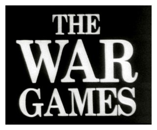
The War Games Episode 1 – The War Games Episode 10 [closing titles only]
The Eurostile font family was designed (by Novarese and Butti in 1952) to complement the titling font, Microgramma, by offering a lowercase alphabet. Issued by the Nebiolo foundry, the rather square sans serif Eurostile became popular for display and advertising use. The linear nature of Eurostile suggests modern architecture, and its attraction is technical and functional. Eurostile is commonly misspelled Eurostyle.
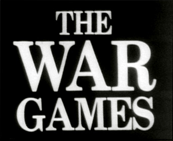
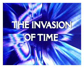
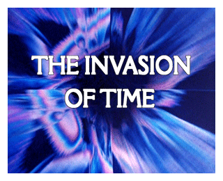
Century Book
A special one-off typeface was used for this serial, to highlight the World War I nature of the story.
Whilst Century is a close example of the font used in the serial, it is not a perfect match. Another close option is Clarendon, however each has it’s own differences from the typeface seen on-screen.
The first Century typeface was cut in 1894 by Linn Boyd Benton in conjunction with T L DeVinne for the Century Magazine. It was a blacker, more readable face than the type previously used. Morris Fuller Benton designed many variants for American Type Founders in the years that followed. In 1975 ITC commissioned Tony Stan to create a new family of Century with a wide range of styles, conforming to the tastes of the day. The ITC Century font family contains a useful range of typefaces for magazine and newspaper work.
Futura Bold
Future Book
Spearhead from Space Episode 1 – The Green Death Episode 6
[Bold opening titles, Book closing titles]
Futura was designed by Paul Renner in 1927, at a time when sans serif faces were advocated for universal acceptance. Futura is based on strict geometric shapes, which give an overall effect of simplicity and clarity. Futura became extremely popular first in Germany and eventually in the USA. Futura is a sans serif font based on geometric shapes which became an integral part of the Bauhaus movement of the 1930s. Some researchers have identified the Futura letterforms as Constructivist, probably due to the circles and straight strokes which coincide with the Bauhaus design school concepts, when the whole thinking was industrial. Form and function became the key words, unnecessary decoration was scorned. Issued by the Bauer Foundry in a wide range of font weights and widths, the Futura font family became a popular choice for text and display setting.
Futura ExtraBold
The Time Warrior Part One – The Seeds of Doom Part Six
For details see Futura above.
Della Robbia Bold
The Masque of Mandragora Part One – The Horns of Nimon Part Four
With occasional variations such as the ‘W’ in ‘WHO’ on end credits for seasons 14 and 15 (made up of two overlapping ‘V’s)
Apparently the original font used by the BBC in the 1970s was called Cantoria. Althouth there is also an digital font called Cantoria, certain characters (the “M” being one) in Della Robbia are a closer match to the font seen on the televised episodes. The Restoration Team currently use Della Robbia as the font when replacing titles on DVD masters.
Designed by Thomas M Cleland, for Lanston Monotype in 1902, based on rubbings of stone-cut capitals seen by the designer in Rome. In style, Della Robbia is like a lineal (sans serif) but with short, tapered serifs. The open nature and the wide range of weights, make the Della Robbia font family ideal for advertising and magazine work. The Cantoria font family is a close alternative.
Helvetica Rounded Bold
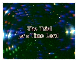
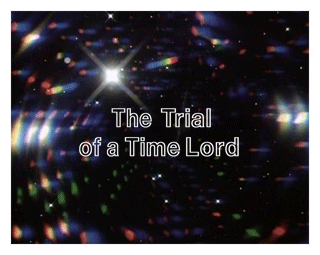
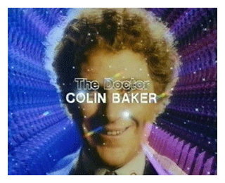
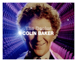
The Leisure Hive Part One – The Trial of a Time Lord Part Fourteen
with uppercase ‘G’ and lowercase ‘t’ from VAG Rounded Bold

The version used in the series was called Formula One (example below) and presented as hollow:

Helvetica Rounded
The basic design of Helvetica Rounded is the same as the design of the normal Helvetica fonts. The only difference is that the stroke endings of Helvetica Rounded are rounded rather than squared. The overall effect of this display type is more playful than its traditional relative. The original Helvetica design was created for the Haas Type foundry in Switzerland and further developed by the Stempel Type foundry and by Linotype. Based on earlier Grotesque designs, Helvetica brought a new level of mathematical accuracy to the sans serif genre. Helvetica is a trademark of Heidelberger Druckmaschinen AG, which may be registered in certain jurisdictions, exclusively licensed through Linotype Library GmbH, a wholly owned subsidiary of Heidelberger Druckmaschinen AG.
VAG Rounded
The VAG Rounded font family was designed for the motor manufacturer, Volkswagen AG in 1979 as a corporate typeface. VAG Rounded is a sans serif face in the grotesque style. It features rounded ends to all strokes. Use VAG Rounded in display sizes for advertising etc.
Helvetica Neue Bold Outline
Attack of the Cybermen Part One – The Trial of a Time Lord Part Fourteen (syndication prints only)
Helvetica Neue Bold Outline is based on the design by Alfred Hoffman with Max Miedinger in 1957. The Helvetica Neue Bold Outline font was redrawn by Linotype in the 1980s. Helvetica is a trademark of Heidelberger Druckmaschinen AG, which may be registered in certain jurisdictions, exclusively licensed through Linotype Library GmbH, a wholly owned subsidiary of Heidelberger Druckmaschinen AG.
Univers Ultra Condensed Light
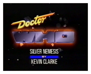
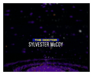
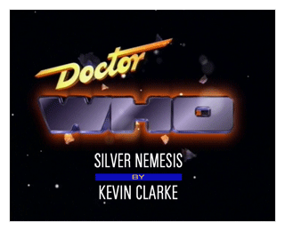
Time and the Rani Part One – Survival Part Three
Used for the story/author credit in the opening titles and the actors and production staff names in closing credits.
The Univers Ultra Condensed font family complements Univers and is useful for headings and display purposes. Univers appeared in 1957 in both film and foundry metal for hand-setting. The extraordinary success of Univers is probably due to Adrian Frutiger’s skilful rendering of a sans serif, which carries no superfluous detail whatsoever. Univers is contemporary with Helvetica and together they transformed the perception of the sans serif style. As its name suggests, the Univers font family can be used for virtually any kind of setting although very lengthy compositions should be avoided. Used in display sizes, this font looks clean and beautifully spaced.
Eurostile Bold Extended
Time and the Rani Part One – Survival Part Three
Used for the ‘by’ credit in the opening titles and the character names and production team job titles in closing credits.
Post Antiqua
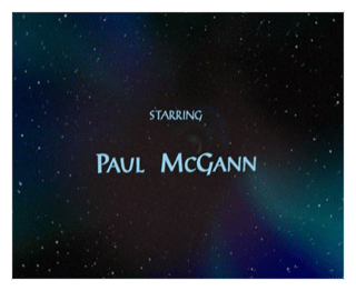
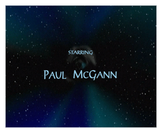
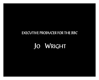
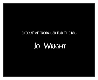
Doctor Who (The TV Movie)
Post Antiqua was designed for the Berthold foundry in 1937. Based on handwritten letterforms, Post Antiqua has a strong calligraphic feel. The capitals are wide and without serifs, the lowercase have small horizontal serifs and short descenders. The Post Antiqua font family is an elegant solution for advertising text and display work.
Futura Book
Rose – The End of Time, Part Two
For details see Futura above.

